
The first day of your first chemistry class, somebody’s going to bring up the periodic table of elements. Similarly, you can’t get very far playing piano without learning about the concept of scales. And if you have just begun a course of study in art and design, buckle up, because somebody’s going to start talking about the color wheel before too long.
The color wheel is a tool used in color theory that helps us understand the relationships between individual colors in order to use them well.
“Sometimes you walk into a room and you think to yourself, ‘I hate this room but I don’t know why,'” says Marcie Cooperman, who has taught color theory at Pratt Institute and Parsons School of Design and is the author of “Color: How to Use It.” “It’s probably the color.”
When you know how different colors relate to each other, you can make your grocery store logo or living room walls or the sweater you’re knitting look really good. If you don’t know about the color wheel … well, you might end up making ugly stuff.
Isaac Newton. Yes, That Isaac Newton.
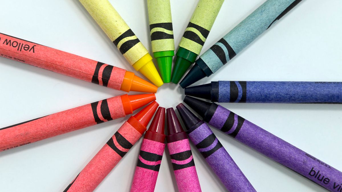
You’ve seen the color wheel before: It’s just a circle that looks like somebody took the rainbow and attached the red end to the violet end, which is basically what Isaac Newton did when he created the first color wheel in 1666. Newton wanted to figure out where color actually comes from — he knew feeding white light through a prism would make the rainbow color pattern we all know and love on the opposite wall: red, orange, yellow, green, blue, indigo, violet (ROYGBIV, for short). What he didn’t understand was why. So, in a darkened room, Newton let a tiny bit of sunlight through a chink in a curtain, making the light diffract through a prism. After messing around with feeding the individual colored lights through other prisms, he came to the conclusion that white sunlight isn’t really white at all, but a combination of all the individual colors. He also noticed red and violet were similar (both contain red), so he twisted the band of color around to form a circle. Once he did that, a lot of mathematical relationships between colors became apparent.
And, with that little matter out of the way, Isaac Newton probably went to breakfast and later that day, moved on to inventing modern physics.
Colors that Complement Each Other
After Newton completed his work on the color wheel, many others had a go at describing the nature of color (including, but not limited to, the 19th century German poet Johann Wolfgang von Goethe), but the 12-color wheel used in modern color theory is basically the same one Newton came up with. It includes the primary colors: red, yellow and blue; the secondary colors: green, orange and purple (each made by mixing two primary colors); and the tertiary colors, which are created by mixing primary and secondary colors next to each other on the wheel: red-orange, blue-green, yellow-green, and so on.
“Colors opposite each other on the color wheel — these are also called complements — have an especially strong relationship,” says Cooperman. “Red and green, blue and orange, yellow and purple are all as different from each other as possible. Opposite colors look more themselves when they’re next to each other. If you put blue next to any color at all — let’s say a yellow — the yellow will look as orange as it can possibly be because it’s next to the blue.”
The triads are the colors 60 degrees apart on the wheel, like the primary and secondary colors. Analogous colors are next to each other on the color wheel, so they form families of color: red, orange and purple have red in common, and therefore are used differently together in art and design than colors in a triad that don’t share a common hue.
The Language of Color
So, colors have relationships to each other, but it’s actually pretty hard to explain colors to other people. Sure, you can tell a friend you just bought a pair of red pants, but what they picture in their head might be anywhere on the red spectrum. How do we explain a color to each other so we know how to describe our new pants?
Here’s some terminology that helps artists and designers talk to each other about color:
Hue
Hue is just the color name: red, yellow, green, blue, etc.
“When we want to describe color accurately, we don’t use words like ‘khaki’ or ‘peach’ because it’s hard to be accurate with names like those,” says Cooperman. “My khaki might be more green and yours might be more of a gray — a third person might say it’s more of a brown. A peach could be considered a pink or an orange.”
People who work with color eschew the names you’d find in a J. Crew catalogue and talk about blue-greens and orange-yellows — descriptions that are easy to agree upon.
Color Value
Value is how light or dark a color is. A navy blue is a very dark color, so it’s considered a very low value blue. Baby blue is a very light color — a tint — and so it’s considered high value.
“If you said to a designer, ‘I saw this blue I really liked — it’s a low value red-blue,’ you’d be describing a navy,” says Cooperman.
Intensity
Intensity has to do with how in-your-face a color is, as opposed to dirty or gray. The highest intensity colors are from that experiment Newton did with the prism — red, orange, yellow, green blue, indigo, violet are all pretty high intensity and eye-catching. That camouflage jacket you got from the Army surplus store in college had a bunch low-intensity browns, greens and grays in it.
Simultaneous Contrast
Something else we have to take into consideration when talking about color is that we perceive a color differently, depending on what color is next to it.
In the mid-19th century, a chemist named Michel Chevreul began creating dyes for the Gobelins carpet factory in Paris. He discovered customers were complaining about the colors in the carpets — that the whites were yellowish, for instance. Chevreul began to experiment with putting color next to color, and discovered that when it was next to purple, white looked as different from purple as possible — it looked yellow, which is the opposite of purple. It’s just a visual effect — colors really affect each other. He called that simultaneous contrast because when you look at it simultaneously, they make each other look as opposite from the other as possible.
Learn more about color theory in “Secret Language of Color: Science, Nature, History, Culture, Beauty of Red, Orange, Yellow, Green, Blue, & Violet” by Joann Eckstut and Arielle Eckstut. HowStuffWorks picks related titles based on books we think you’ll like. Should you choose to buy one, we’ll receive a portion of the sale.
READ MORE
7 Crocodilian Species That Are Dangerous to Humans
Most people have a primordial fear of spiders and snakes and, of course, of predators [...]
Microscopy method overcomes the traditional resolution limit for the fast co-tracking of molecules
Fiona Cole and Jonas Zähringer, joint lead authors of the paper, calibrate a fluorescence microscope. [...]
A Spaceship Visits the National Mall
Feedloader (Clickability) Visitors to the National Mall will get a treat today. Parked just outside [...]
These Prehistoric Sharks Had Jaws Shaped Like Circular Saws and Sawtoothed Scissors
An illustration of the ancient shark Edestus heinrichi preying on a fish. Many ancient sharks [...]
July 10 Birthday Astrology
The astrological symbol for Cancer, the fourth sign of the year, is the Crab. Numerology [...]
Researchers realize half-metallicity in A-type antiferromagnets with ferroelectric control
Fig. 1. The schematic illustration of ferroelectric control of half-metallicity in A-type antiferromagnets. Credit: JIANG [...]
Paleontologists Discover 52-Million-Year-Old Bat
The fossil of Icaronycteris gunnelliRietbergen et al., 2023, PLOS One, CC0 The fossil record is [...]
This Whale Sculpture Was Modeled After a Beached Orca
Legacy is scheduled to be on display at the Ontario Science Centre beginning in 2017 [...]